Converting landing page for all memberships
Converting landing page for all memberships
Description
Description
The Royal Institute of Philosophy (TRIP), a UK-based organisation with over 100 years of history, sought to launch a new membership programme. The goal was to strengthen its community while generating sustainable revenue. A key focus was the design of the "All Membership Types" landing page, which serves as the entry point for potential members to explore and select the membership that best suits their needs.
The Royal Institute of Philosophy (TRIP), a UK-based organisation with over 100 years of history, sought to launch a new membership programme. The goal was to strengthen its community while generating sustainable revenue. A key focus was the design of the "All Membership Types" landing page, which serves as the entry point for potential members to explore and select the membership that best suits their needs.
Problem
Problem
TRIP risks losing potential sign-ups and community growth without a clear, compelling landing page to help users explore membership options and understand their value.
TRIP risks losing potential sign-ups and community growth without a clear, compelling landing page to help users explore membership options and understand their value.
Impact
Impact
Over 80% of users rated their likelihood to join a membership 7/10 or higher.
Over 80% of users rated their likelihood to join a membership 7/10 or higher.
83.3% of users felt the page improved their understanding of the member benefits.
83.3% of users felt the page improved their understanding of the member benefits.
Company
Company
The Royal Institute of Philosophy (TRIP)
The Royal Institute of Philosophy (TRIP)
My role
My role
Lead UX/UI designer
Lead UX/UI designer
Timeline
Timeline
3 weeks, Oct 2024
3 weeks, Oct 2024
Full team
Full team
Lead UX/UI designer, 1 developer, 1 copywriter (specialising in philosophy-specific content), Assistant and Managing Director.
Lead UX/UI designer, 1 developer, 1 copywriter (specialising in philosophy-specific content), Assistant and Managing Director.
Risk of low conversion due to users missing the value
Risk of low conversion due to users missing the value
The user problems:
The user problems:
Potential members need a clear and accessible way to explore the different membership options. Without an intuitive, well-structured landing page, they may struggle to understand the value of each option or determine which best suits their needs, risking hesitation and drop-offs during the decision-making process.
Potential members need a clear and accessible way to explore the different membership options. Without an intuitive, well-structured landing page, they may struggle to understand the value of each option or determine which best suits their needs, risking hesitation and drop-offs during the decision-making process.
The business problems:
The business problems:
Without a compelling and well-organised membership landing page, TRIP risks losing potential sign-ups, limiting the success of its new membership programme. This could hinder the organisation’s ability to build a strong, engaged community and generate the sustainable revenue needed to support its long-term goals and mission.
Without a compelling and well-organised membership landing page, TRIP risks losing potential sign-ups, limiting the success of its new membership programme. This could hinder the organisation’s ability to build a strong, engaged community and generate the sustainable revenue needed to support its long-term goals and mission.
Collaborative ideation
Collaborative ideation
Virtual team workshop lead to actionable concepts
Virtual team workshop lead to actionable concepts
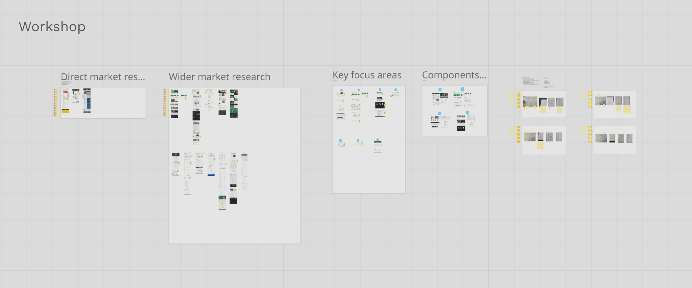
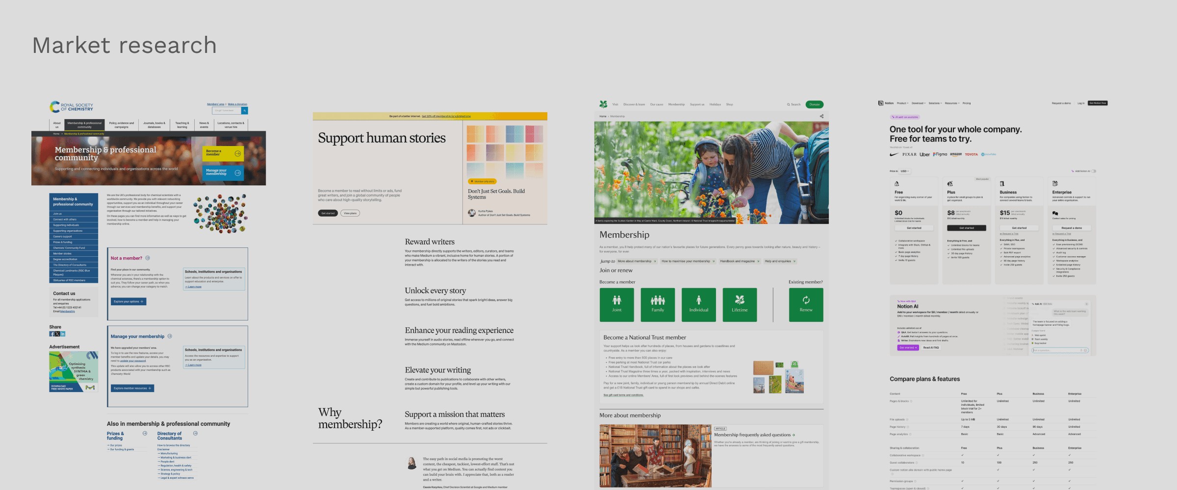
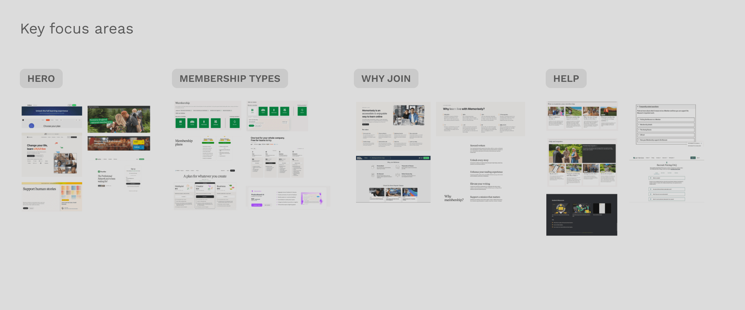
The workshop began with a self-paced phase, where team members independently gathered and annotated examples from competitors and broader industries on a shared Miro board, identifying successful design elements. In the live Zoom session that followed, I guided the team in organising these insights into key themes, highlighting effective layouts and user experiences.
The workshop began with a self-paced phase, where team members independently gathered and annotated examples from competitors and broader industries on a shared Miro board, identifying successful design elements. In the live Zoom session that followed, I guided the team in organising these insights into key themes, highlighting effective layouts and user experiences.
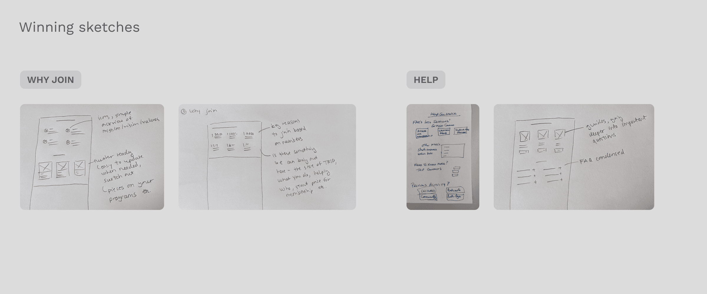
We then ran a "Crazy 4s" rapid ideation exercise, where each member sketched four quick concepts in four minutes. This dynamic activity encouraged diverse ideas and collaborative evaluation, enabling us to refine and vote on the most promising solutions. The results provided a strong foundation for developing creative and practical approaches tailored to the landing page.
We then ran a "Crazy 4s" rapid ideation exercise, where each member sketched four quick concepts in four minutes. This dynamic activity encouraged diverse ideas and collaborative evaluation, enabling us to refine and vote on the most promising solutions. The results provided a strong foundation for developing creative and practical approaches tailored to the landing page.
Concept 1
Concept 1
Deep dive into benefits
Deep dive into benefits
Solution
Solution
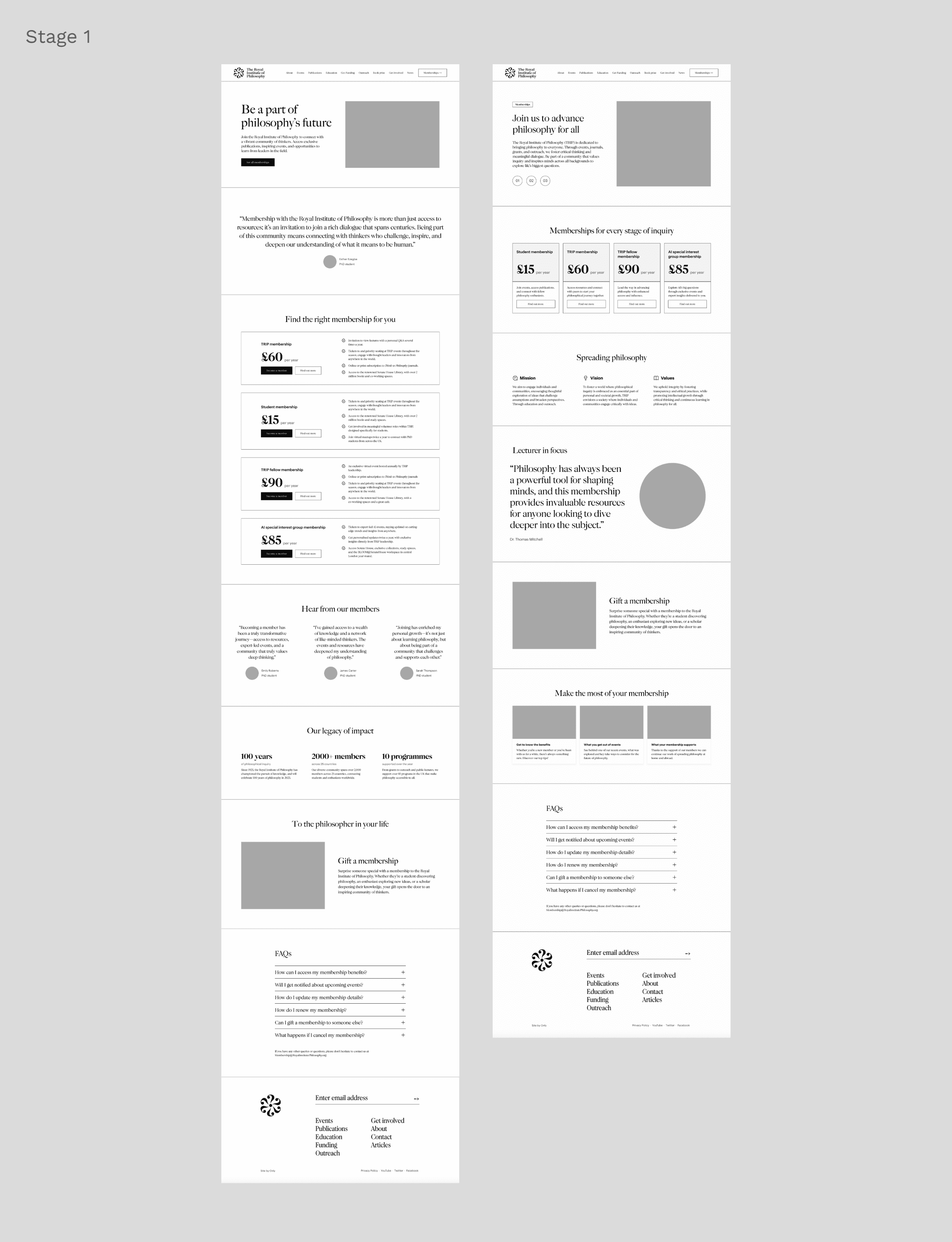
Builds trust with a key review, leveraging social proof to increase user confidence by showing others are already engaging with the membership.
Builds trust with a key review, leveraging social proof to increase user confidence by showing others are already engaging with the membership.
Includes two clear membership CTAs in the hero space, making it easy for users to quickly understand and choose the right option.
Includes two clear membership CTAs in the hero space, making it easy for users to quickly understand and choose the right option.
Exposes all membership benefits upfront, reducing uncertainty and encouraging users to feel confident in their choice with easily accessible information.
Exposes all membership benefits upfront, reducing uncertainty and encouraging users to feel confident in their choice with easily accessible information.
Highlights TRIP’s impact, fostering a deeper connection by making users feel more invested in the organisation’s mission.
Highlights TRIP’s impact, fostering a deeper connection by making users feel more invested in the organisation’s mission.
Drawbacks
Drawbacks
May not fully engage new users unfamiliar with TRIP’s mission, as the messaging assumes prior knowledge.
May not fully engage new users unfamiliar with TRIP’s mission, as the messaging assumes prior knowledge.
The lack of interactivity may limit engagement, missing the opportunity to spark users’ curiosity and encourage further exploration.
The lack of interactivity may limit engagement, missing the opportunity to spark users’ curiosity and encourage further exploration.


Concept 2
Concept 2
Compare all types
Compare all types
Solution
Solution
Uses a carousel format to engage users and encourage exploration with dynamic content.
Uses a carousel format to engage users and encourage exploration with dynamic content.
Offers a side-by-side comparison of membership options, reducing decision fatigue and simplifying evaluation.
Offers a side-by-side comparison of membership options, reducing decision fatigue and simplifying evaluation.
A single CTA in the membership feature card encourages a small commitment, leveraging commitment bias to make it easier for users to proceed and increase the likelihood they’ll continue.
A single CTA in the membership feature card encourages a small commitment, leveraging commitment bias to make it easier for users to proceed and increase the likelihood they’ll continue.
Offers a quick overview of TRIP’s mission, vision, and values, helping users feel more informed and connected, which boosts their sense of commitment to the organisation.
Offers a quick overview of TRIP’s mission, vision, and values, helping users feel more informed and connected, which boosts their sense of commitment to the organisation.
Includes guides, FAQs, and contact options to reduce uncertainty and ensure users have the information they need to make a confident decision.
Includes guides, FAQs, and contact options to reduce uncertainty and ensure users have the information they need to make a confident decision.
Drawbacks
Drawbacks
The carousel format may hide key membership details, potentially delaying decisions or causing frustration if users miss critical information.
The carousel format may hide key membership details, potentially delaying decisions or causing frustration if users miss critical information.
Side-by-side membership benefits only work if there’s enough variation to create clear contrast; otherwise, users may struggle to choose.
Side-by-side membership benefits only work if there’s enough variation to create clear contrast; otherwise, users may struggle to choose.
Blocks of text on TRIP’s mission and values could overwhelm users, causing disengagement and decision fatigue.
Blocks of text on TRIP’s mission and values could overwhelm users, causing disengagement and decision fatigue.
Further developing the initial concepts
Further developing the initial concepts
I refined the two initial concepts generated during the workshop by exploring multiple directions for structure and content. Through iterative design, I worked to align the page with user needs while tackling challenges like accessibility, adaptability across membership types, and fostering a sense of community. Several feedback sessions with the team helped evaluate these directions and ensure the final design aligned with the project's objectives.
I refined the two initial concepts generated during the workshop by exploring multiple directions for structure and content. Through iterative design, I worked to align the page with user needs while tackling challenges like accessibility, adaptability across membership types, and fostering a sense of community. Several feedback sessions with the team helped evaluate these directions and ensure the final design aligned with the project's objectives.
A/B test with TRIP members
A/B test with TRIP members
To determine which landing page design to move forward with, I conducted an A/B test with TRIP members, comparing the two concepts.
To determine which landing page design to move forward with, I conducted an A/B test with TRIP members, comparing the two concepts.
The results:
The results:
Version B was preferred by 66.7% of users.
Version B was preferred by 66.7% of users.
Over 80% of users rated their likelihood to join as 7/10 or higher, indicating strong potential for membership conversion.
Over 80% of users rated their likelihood to join as 7/10 or higher, indicating strong potential for membership conversion.
83.3% of users felt the page improved their understanding of TRIP membership benefits.
83.3% of users felt the page improved their understanding of TRIP membership benefits.
TEST A
TEST A

TEST B
TEST B

Combining impactful elements from both versions
Combining impactful elements from both versions
While Version B was preferred by the majority of members for its community-focused design, several impactful elements from Version A were also well-received. In particular, the clear layout and information-rich approach from Version A, which helped members better understand the benefits, were seen as valuable additions. By merging these key aspects of both designs, I was able to create a more comprehensive and engaging user experience.
While Version B was preferred by the majority of members for its community-focused design, several impactful elements from Version A were also well-received. In particular, the clear layout and information-rich approach from Version A, which helped members better understand the benefits, were seen as valuable additions. By merging these key aspects of both designs, I was able to create a more comprehensive and engaging user experience.
Version A
Version A

Create a community feel
Create a community feel
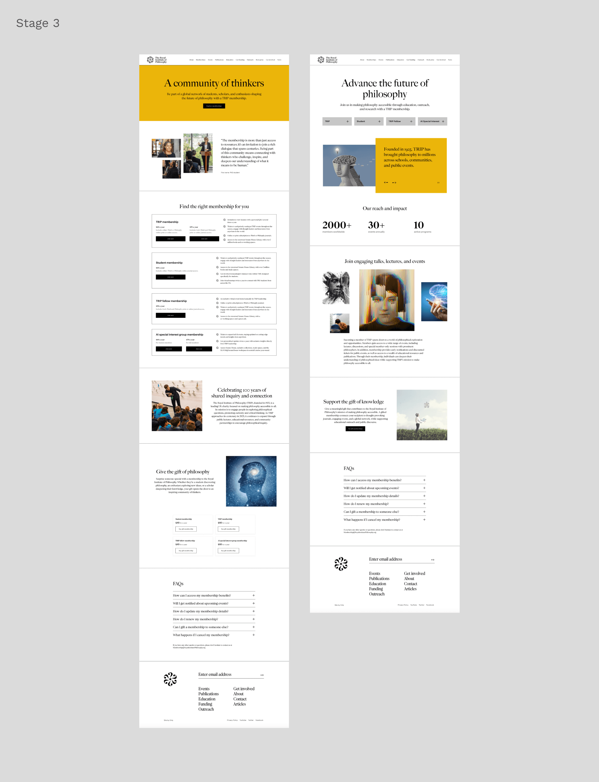
Use the hero messaging from Version A, such as "a community of thinkers," to better connect with TRIP's mission and values.
Use the hero messaging from Version A, such as "a community of thinkers," to better connect with TRIP's mission and values.
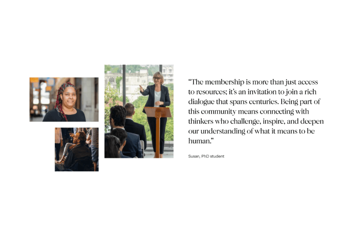
A quote gives social proof
A quote gives social proof
The quote resonated well, members thought it gave a face to the membership.
The quote resonated well, members thought it gave a face to the membership.
Version B
Version B
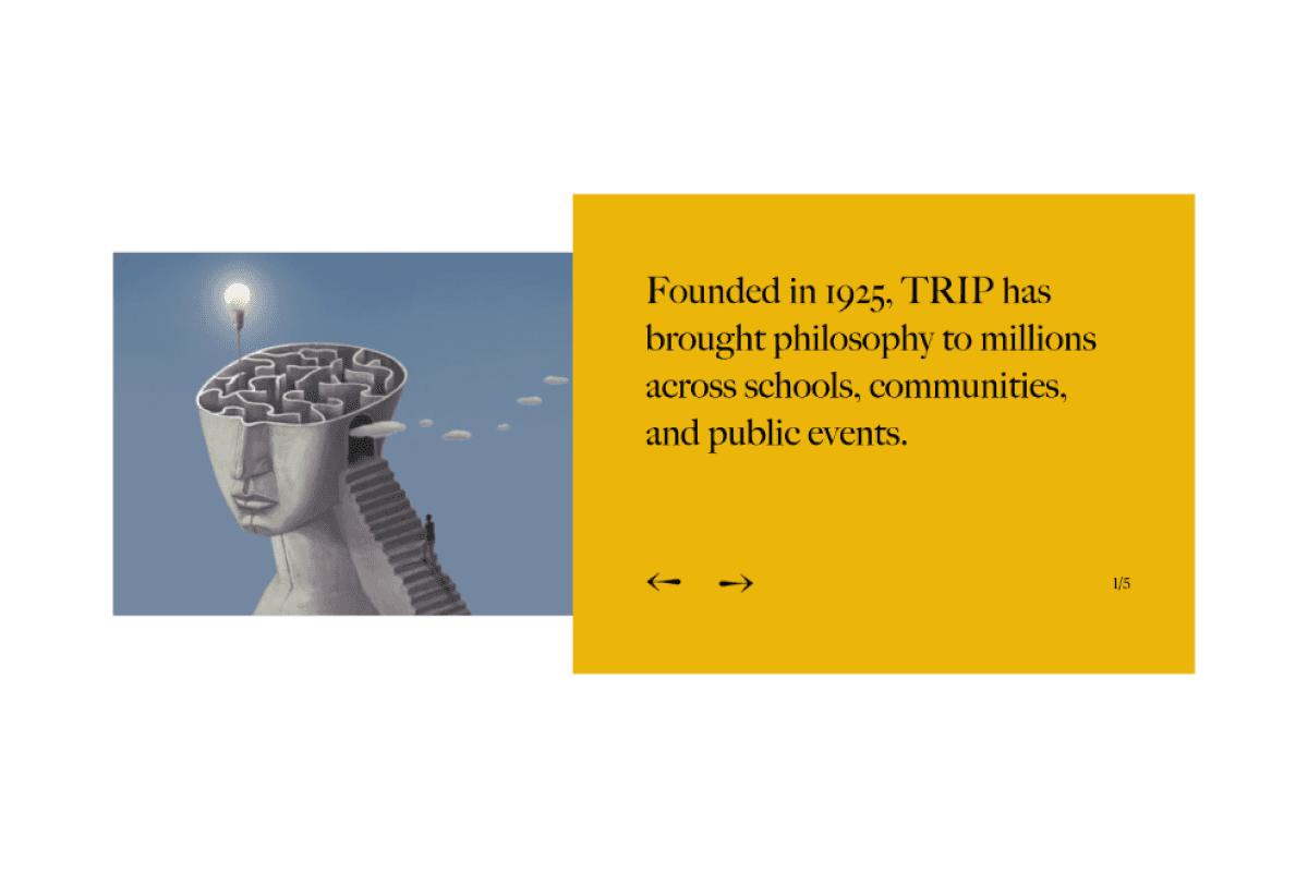
Inspire interaction
Inspire interaction
Members really liked the slider. They found it engaging, visually appealing and informative as it lists the institutes activities.
Members really liked the slider. They found it engaging, visually appealing and informative as it lists the institutes activities.
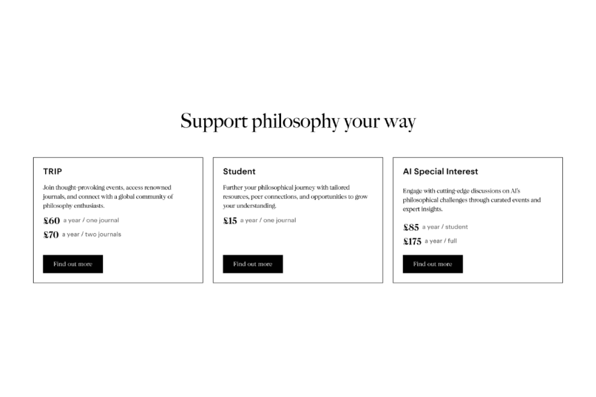
Give an clear overview
Give an clear overview
The benefit section in B was preferred, members thought it was well-explained and as a flow it felt more natural pick your type to read more.
The benefit section in B was preferred, members thought it was well-explained and as a flow it felt more natural pick your type to read more.
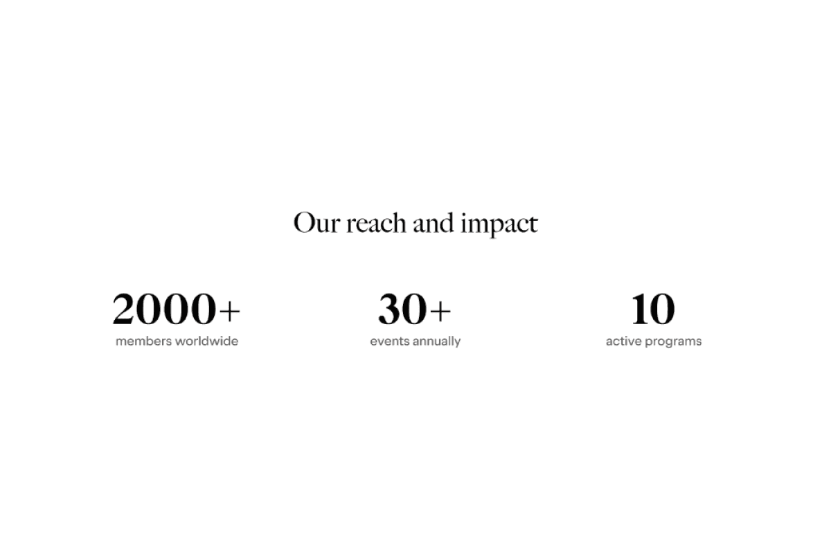
Use data to show impact
Use data to show impact
Members felt the data points were great at showing the reach of TRIP and it’s impact in the wider community.
Members felt the data points were great at showing the reach of TRIP and it’s impact in the wider community.
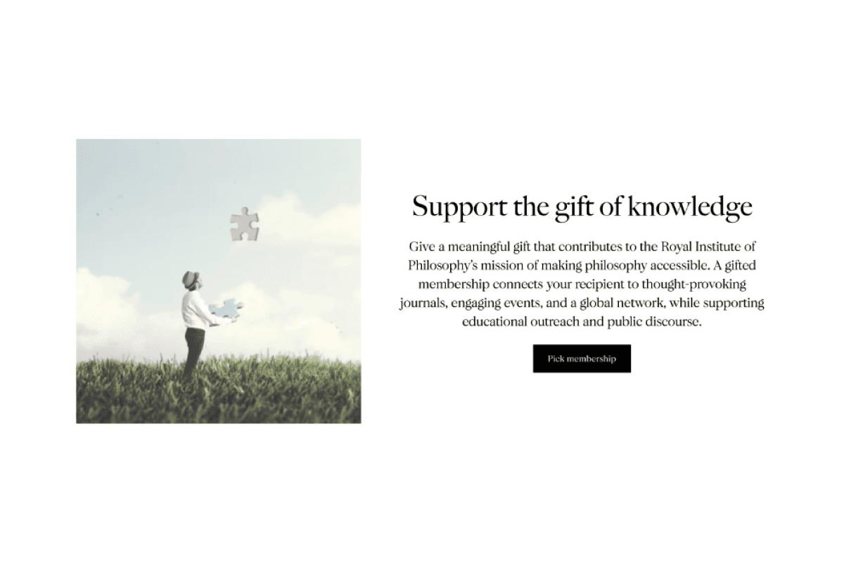
Set the scene
Set the scene
The wording 'Support the gift of knowledge’ in the gift component for B felt warm to members.
The wording 'Support the gift of knowledge’ in the gift component for B felt warm to members.
Final designs
Final designs
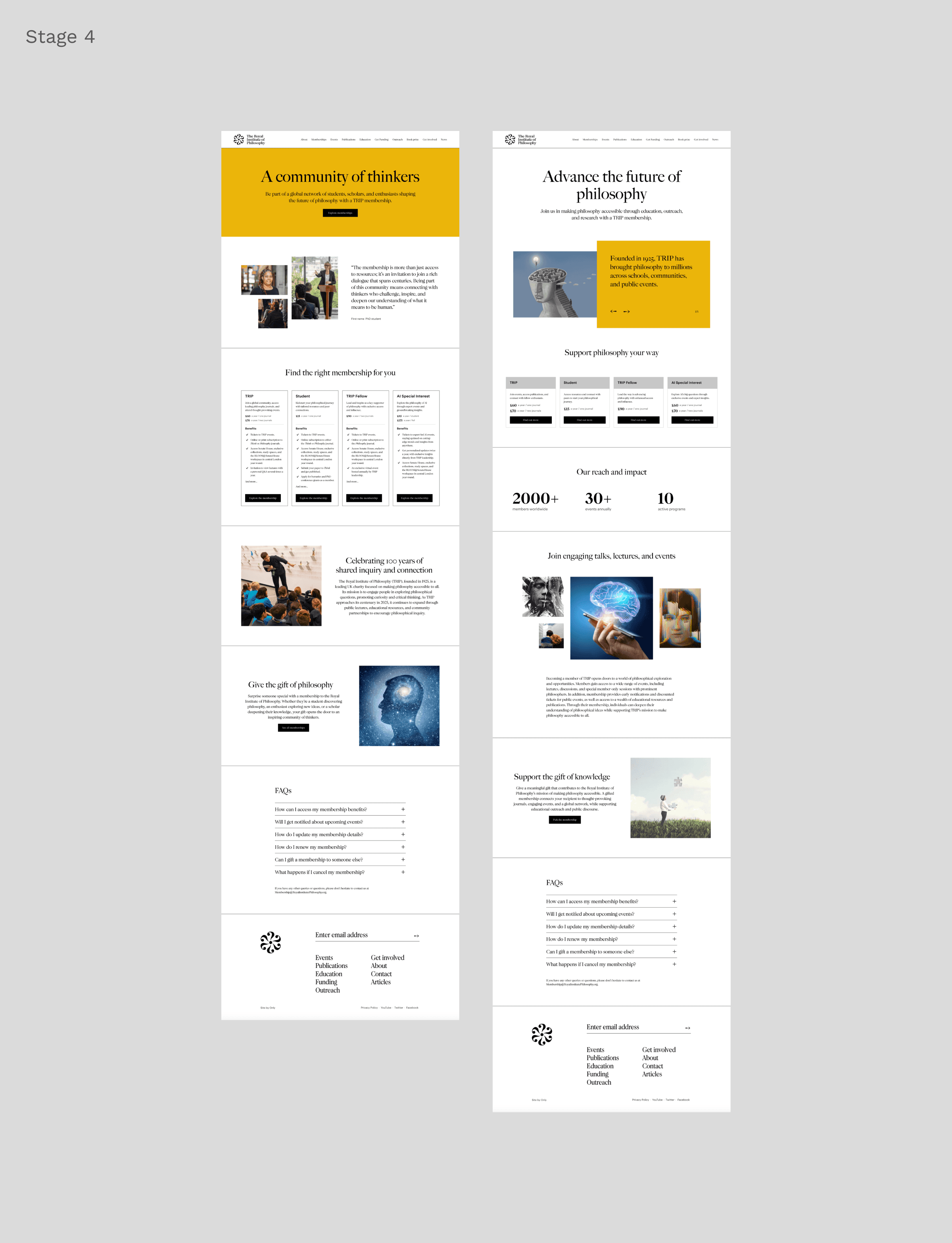
The project delivered a streamlined, user-focused membership funnel for the Royal Institute of Philosophy, centred on the "All Memberships" landing page. This page offers a clear comparison of membership options, linking to detailed pages that highlight benefits, creating a cohesive experience that drives sign-ups and long-term engagement.
The project delivered a streamlined, user-focused membership funnel for the Royal Institute of Philosophy, centred on the "All Memberships" landing page. This page offers a clear comparison of membership options, linking to detailed pages that highlight benefits, creating a cohesive experience that drives sign-ups and long-term engagement.
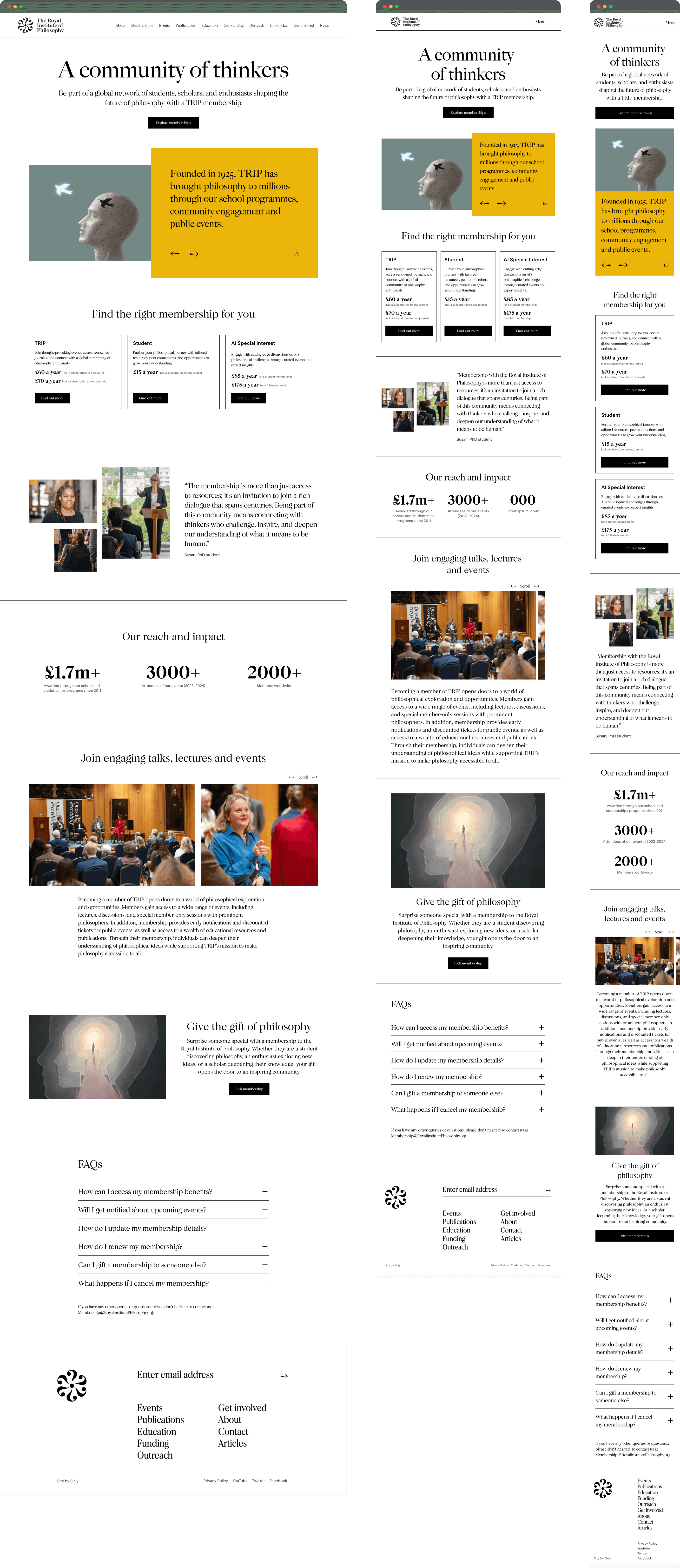
"Gives a warm, community-based feel. It really feels like I'm joining something bigger. The purpose of TRIP is clear, and the membership benefits are well-explained."
"Gives a warm, community-based feel. It really feels like I'm joining something bigger. The purpose of TRIP is clear, and the membership benefits are well-explained."
"Gives a warm, community-based feel. It really feels like I'm joining something bigger. The purpose of TRIP is clear, and the membership benefits are well-explained."
Reflections
Reflections
Holistic design strengthens the experience
Holistic design strengthens the experience
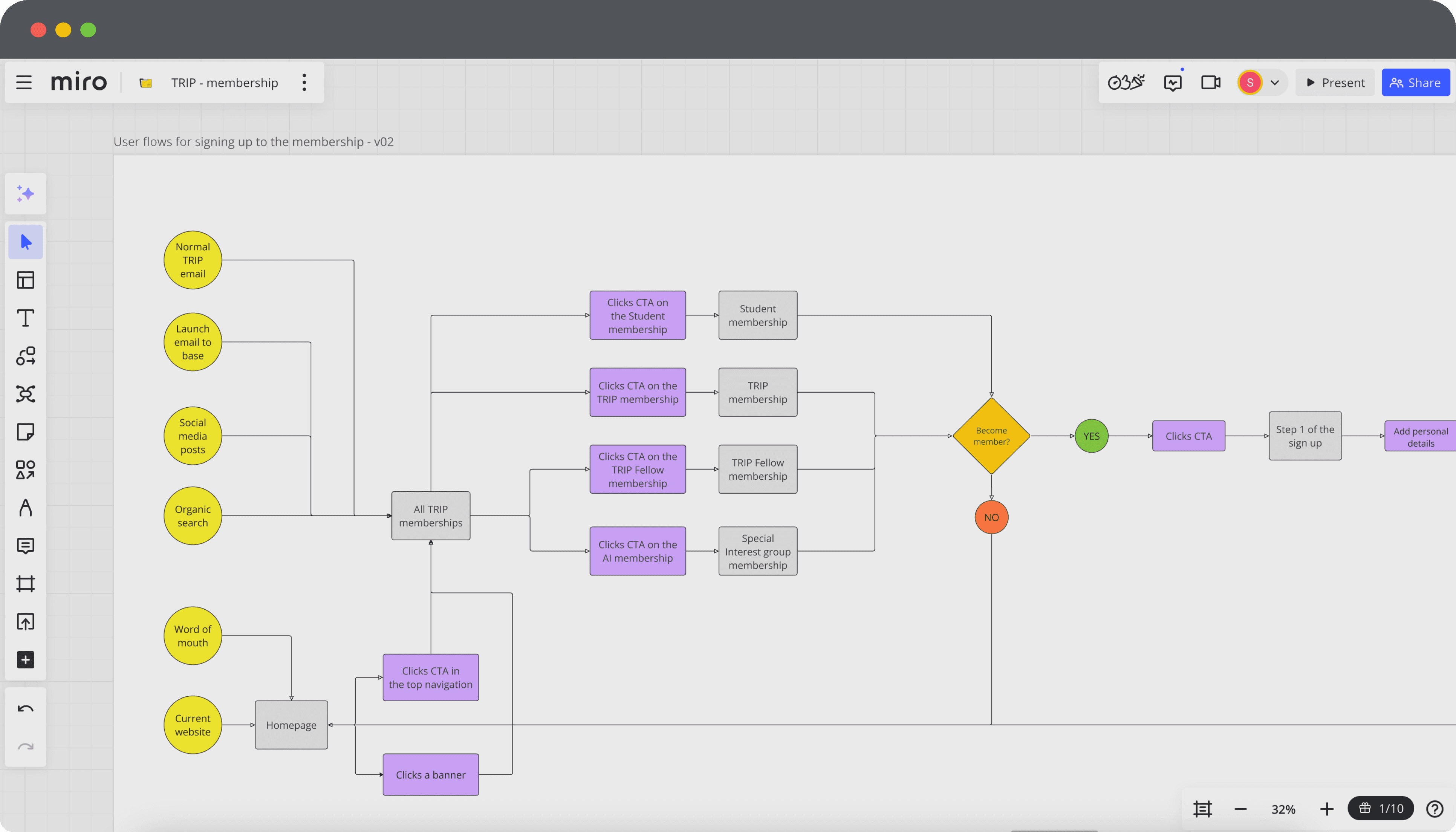
Mapping out the entire membership journey made me realise how crucial it is to think about the experience from all angles. I now prioritise creating a seamless flow at every touchpoint, ensuring all elements work together to deliver a cohesive and intuitive user experience.
Mapping out the entire membership journey made me realise how crucial it is to think about the experience from all angles. I now prioritise creating a seamless flow at every touchpoint, ensuring all elements work together to deliver a cohesive and intuitive user experience.
Leveraging structured testing
Leveraging structured testing
Running A/B tests highlight the importance of using a systematic approach to testing and feedback. By analysing results within the broader project context, I was able to make strategic, data-informed decisions that supported both user needs and business objectives.
Running A/B tests highlight the importance of using a systematic approach to testing and feedback. By analysing results within the broader project context, I was able to make strategic, data-informed decisions that supported both user needs and business objectives.
Engaging customers through a live brand event
Engaging customers through a live brand event
Fabletics x POPfit
© Stina Slingo 2026
